Back in February (is it really almost April?), we made a post about the V1.0 definition of Open Source Hardware. It is a little bit long to post here, but you can read the definition in its entirety at this page. However, this statement of principle kind of sums up the basic idea behind the movement:
"Open source hardware is hardware whose design is made publicly available so that anyone can study, modify, distribute, make and sell the design or hardware based on that design. The hardware's source, the design from which it is made, is available in the preferred format for making modifications to it. Ideally, open source hardware uses readily-available components and materials, standard processes, open infrastructure, unrestricted content, and open-source design tools to maximize the ability of individuals to make and use hardware. Open source hardware gives people the freedom to control their technology while sharing knowledge and encouraging commerce through the open exchange of designs."
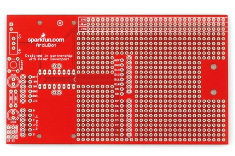
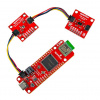
An example of an "open source" piece of hardware - the ArduBot.
Along with the definition, an important building block for this movement is a logo that you can stamp on your hardware that says, "This is open source. Enjoy!" After a couple months of designing and re-designing, a handful of logos have been decided on and are now up for public vote. Which brings us to the point of this post - it's time to vote! The vote ends April 5th, so get your vote in now.


I voted but i'm a little underwhelmed with all of them...
agreed... if you want the best design, invite a selection committee of the most instrumental people IN DESIGN, not electronics. Letting engineers choose your logo is like letting Helen Keller drive your car.
True, but try to get people who are instrumental in DESIGN, not just Industrial or Consumer Electronics Design, but DESIGN...and see if you can get anybody to actually give you the time of day and/or not want $50K for the effort up front.
there is a website just for that. you tell them you want a logo and you set the price you want to pay. they submit their designs and who ever you pick wins the money you put up. it starts at like $200.00 USD and you can go up from there. no one gets paid till you pick the one that wins.
Yeah, that'll work about as well as Rentacoder. It's called spec work, and it's something that most competent designers abhor.
dam dude thats harsh... but i must agree, i feel the same way
sorry, you're right, I went a little too far. I'm sure the committee did their best and the selections are all good solid logos. I just feel that there are a couple of even better choices on the submissions page that didn't make the cut somehow
Can we just do what the Academy Awards did in the wake of that terrible Jai Ho song that won best original song in 2008, and change the rule so that if there is no entry worthy of the prize, that it simply isn't awarded?
Of all the logos, I find only the copyleft chip is "brandable." Even so, it suffers from easily being turned upside down in the absence of any other text. A very weak field indeed.
Agreed. Aren't there any graphic design professionals that also explore electronics?
There is just something organic in a good logo. It's text and graphics, but it's something more - you know what the organization is all about just by glancing at it, without having to read the text or infer from the graphics.
"...but i'm a little underwhelmed with all of them"
I don't see the logo that was mentioned earlier (the one on the example above) on the list. Did it not make the cut? I would have voted for that one over the others shown.
edit: I'm not sure what is going on with the 'multi-logo' submissions (38 & 95). Which one am I supposed to vote for? If it does win, which one will get used?
Voted....i wish i had a little sticker like when you go to the real polling place
Am I the only one who thinks the copyleft logo should be disqualified?
OSHW is not by its nature copyleft, and that alone should disqualify it. I understand that certain OSI licenses which are copy left can be used with it, but thats a different issue.
Personally, I find the notion of forcing the copy-left agenda on to OSHW perfectly repugnant.
I would go as far to say I will not purchase any hardware with such a logo on it.
It's a nice looking logo though.
It's a nice looking logo in general, but it does have some issues.
For one, it seems to limit things quite a bit to electronics. That might not be a huge issue, as it looks like most of the goals are around electronics anyway.
For two, the author suggests it could be used without the accompanying text. I disagree, as turning it around 180 degrees clearly makes the copyleft reversed 'c' a regular 'c' again.
For three, I'll just echo what you said.. the logo should be neutral in what type of openness it is supposed to promote.
Well, this is...interesting. Golden Orb and copyleft chip were neck and neck for the past 3 days, with golden orb winning literally but just a few votes every time I checked. Now I check again tonight to see copyleft has spontaneously gained a 2289 vote lead. This seems rather fishy to me. The method is already trivial enough, having a select group chose 10/129 submissions then leaving an open poll to the public. I'd hate to see a winner being chosen because a few people decided they'd spoof the vote in their favor.
Yep, the whole thing is rigged, and anyone can do it :
Remove the cookies for micropoll.com, reload the OSHW page and vote again, and again, and again ...
This is ridiculous and the whole process needs to be stopped.
BTW, some comments (including mine with calculation proving 90% of Sunday votes were for "copyleft chip") have been removed from this board (you can see 32 comments and the total is still 45).
Looks like this has since been addressed so that only 1 vote can be issued per IP. This still has issues I won't go into here, but should at least stop a mass-vote.
They're still looking into removing the existing mass-votes.
Yeah... I'll admit I voted twice with a certain program to test it, and it took about 8 seconds to do. Could be very easily automated and streamlined. The poll is rendered completely useless, I sincerely hope they decide not to use the results. As much as it would suck, the best the can probably do is open a new poll that requires registration, or in the very least, require a captcha each vote to reduce automated entries.
Maybe I am missing something here, but IMHO there is no need for another logo. The Open Source logo already exists:
http://www.opensource.org/logo-usage-guidelines
If Open Source Hardware is NOT Open Source, what is it?
If it IS Open Source, the logo is already done.
Can we please stop squandering time and effort on creating the impression of divergence? Can we please focus on our common vision and shared values, get over ourselves and reiterate our message by using one logo. IMHO using the existing logo would be more powerful than using a different logo. A different logo unequivocally says "I am different from Open Source".
Not a bad point GB-). I also think there is a little merit to what sentryGun53 says. Oh well, symbolism over substance seems to be the norm these days.
Personally I think I'll quit worrying about it and just stick to enjoying the sweet smell of melting solder.
I love the smell of hot rosin in the morning...
Mate the Horde project logo and the Open Source logo and you get the third logo in the selection.
I voted as well and agree with the general feeling of "underwhelmed-ment". Nearly 7 billion people will be stuck with the logo chosen for a long time to come.
I'm not a fan of any of those selections. I prefer the graphic SparkFun has been using (shown above). Bummer.
Without hesitation, I'd go for 16 (golden orb) for many reasons:
- It's not restricted to electronics, and includes all physical objects;
- The gears are a symbol of things that go together well, elements of something bigger than it's individual components;
- Open source/hardware is a movement, and gears are designed to carry and transform movement;
- It's very close to the official Open source logo and as such clearly indicates it's a continuation of the same ideas.
Sorry Sparkfun, it's not red !
"It's very close to the official Open source logo and as such clearly indicates it's a continuation of the same ideas."
I'm curious what Open Source Initiative actually thinks about this. The Open source logo you refer to is trademarked. Although I would like to think that OSI would welcome such an extension (although perhaps they'd prefer if open source hardware would simply use their existing logo), perhaps they (or their legal team) think it would dilute their trademark value, etc.
Me Too! 'Cept it's way harder to etch than the Copyleft Chip.
As of now, Golden Orb and Copyleft Chip are neck 'n' neck! This is way more exciting than I thought it would be.
You just need to etch the logo outline. It does not need to be filled, and the symbol can be used without the "Open Hardware" words.
You can have a look at all the Open source logo variants.
I like very much that it creates continuity with the OpenSource Logo.
I could envision an overlay that would indicate Open Hardware & Software
I agree with others, the Top 10 could have been chosen better.
I Like:
- Unlocked lock (seems universal)
- Chip icon (ditto)
I Don't Like:
- Gears (nerdy, but not relevant)
- English words, acronyms (not universal, cryptic)
- Fisting chips, butterflies (see other submissions)
- "Copyleft" (an arcane, English-centric play on words)
So my favorites are the couple that include chips with unlocked locks on them, but didn't make the Top 10. They seem just right.
so somebody has said it:
Despite the votes I think the geared logo (19) is the best executed. Its got a nice 3D feel to it, its easy to etch (but so are all the others) and it encapsulates three concepts very succinctly:
openness - by way of having an open outline,
mechanical hardware - it's a gear
electronics - the outline ends in little bulbs like a PCB trace
I think it's very iconic too.
It probably will not win, but I wanted to give my kudos among everyone declaring that these all suck. Designing a simple yet resonant logo for such a broad concept is not easy, and most of these logos do a pretty good job.
Copyleft Chip, ftw
Once the fraudulent votes are removed, the winner is ... Golden Orb
I find the copyleft chip very unimpressive when it comes to a logo for open source hardware.
As a design itself, it is nice, but for open source hardware, I don't see anything that deals with "open." All I see is, "Hey, copy me!"
I personally went with Geared since that can be glanced at and go, "Oh, that's an open hardware."
I'm voting for the copyleft chip despite its problems.
Why only one logo? If it truly is open source, shouldn't anybody be able to put the open-source logo they want on it?
Just my 2 cents
Assuming other logos are not copyrighted, then people can put them on stuff or make there own, but I think you might be missing the point a bit.
A single logo is being agreed upon to act as a certification and brand of products that adhere to the OSHW standard. Think of it as a flag for the movement.
Uggh. Let's all vote for the "Least Lame Logo". What a bunch of pathetic looking choices. I finally went with Golden Orb.
Crap.. Now I should be stabbed for TRIPLE posty goodness. whoops
Crap. Sorry about double posty goodness
I am conflicted.... Well first for those of you that say that none of the logos are that impressive, you gotta think about it. It needs to be something you can etch on a board, weather by machine or by hand.
This brings me to my conflict.
3 Iconographic Microchip looks like it would be easily noticable on a board but just as a whole doesn't say "Open Source" to me.
14 OpnKy. Meh. Doesn't make sense to me
16 Golden Orb - Looks nice but no way you could etch that easily.
28 Copyleft Chip - This one looks more like a winner. Simple, easy to etch, catchy. However you would have to think a little bigger if you want to spot it on a board. This one seems to be my winner at the moment.
4 OSHW connections - Looks cool but for some might get mistaken for a place to put a crystal :P
38... meh
52 OSHW BOT Not too bad. It's definitely up in my top 3
53 Osmosis - Would be perfect on a package. not too easy to etch lettering on a board though.
84 Open Key (see #14)
95 Geared (see #16)
voted.
As I hold my dremelesque tool, none of them look quite as friendly to put on a piece as I might hope.
voto a favor !