Graph Sensor Data with Python and Matplotlib
 Shawn Hymel
Update a Graph in Real Time
Waiting to collect measurements from a sensor before plotting it might work in some situations. Many times, you would like to be able to monitor the output of a sensor in real time, which means you can look for trends as they happen. To accomplish that, we will create an animation where a temperature sample is taken and the graph is updated immediately.
Animation Code
Open a new file (once again, make sure it's in the same directory as tmp102.py so that we can use the tmp102 module). Copy in the following code:
language:python
import datetime as dt
import matplotlib.pyplot as plt
import matplotlib.animation as animation
import tmp102

# Create figure for plotting
fig = plt.figure()
ax = fig.add_subplot(1, 1, 1)
xs = []
ys = []

# Initialize communication with TMP102
tmp102.init()

# This function is called periodically from FuncAnimation
def animate(i, xs, ys):

    # Read temperature (Celsius) from TMP102
    temp_c = round(tmp102.read_temp(), 2)

    # Add x and y to lists
    xs.append(dt.datetime.now().strftime('%H:%M:%S.%f'))
    ys.append(temp_c)

    # Limit x and y lists to 20 items
    xs = xs[-20:]
    ys = ys[-20:]

    # Draw x and y lists
    ax.clear()
    ax.plot(xs, ys)

    # Format plot
    plt.xticks(rotation=45, ha='right')
    plt.subplots_adjust(bottom=0.30)
    plt.title('TMP102 Temperature over Time')
    plt.ylabel('Temperature (deg C)')

# Set up plot to call animate() function periodically
ani = animation.FuncAnimation(fig, animate, fargs=(xs, ys), interval=1000)
plt.show()
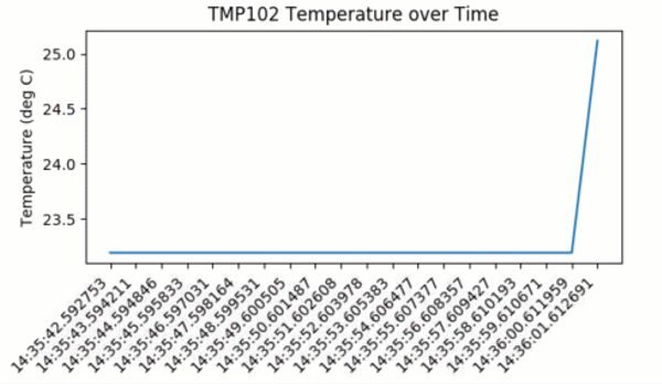
Save and run the code. You should immediately see a graph that gets updated about once every second. Feel free to breathe on the sensor to see how the temperature fluctuates.
Code to Note
To create a real-time plot, we need to use the animation module in matplotlib. We set up the figure and axes in the usual way, but we draw directly to the axes, ax, when we want to create a new frame in the animation.
At the bottom of the code, you'll see the secret sauce to the animation:
ani = animation.FuncAnimation(fig, animate, fargs=(xs, ys), interval=1000)
FuncAnimation is a special function within the animation module that lets us automate updating the graph. We pass the FuncAnimation() a handle to the figure we want to draw, fig, as well as the name of a function that should be called at regular intervals. We called this function animate() and is defined just above our FuncAnimation() call.
Still in the FuncAnimation() parameters, we set fargs, which are the arguments we want to pass to our animate function (since we are not calling animate() directly from within our own code). Then, we set interval, which is how long we should wait between calls to animate() (in milliseconds).
animate does not have any parentheses. This is passing a reference to the function and not the result of that function. If you accidentally add parentheses to animate here, animate will be called immediately (only once), and you'll likely get an error (probably something about a tuple not being callable)!If you look at the call to animate(), you'll see that it has 3 parameters that we've defined:
def animate(i, xs, ys):
i is the frame number. This parameter is necessary when defining a function for FuncAnimation. Whenever animate() is called, i will be automatically incremented by 1. xs and ys are our lists containing a timestamp and temperature values, respectively. We told FuncAnimation() that we wanted to pass in xs and ys with the fargs parameter. Without explicitly saying we want xs and ys as parameters, we would need to use global variables for remembering the values in xs and ys.
Within animate(), we collect the temperature data and append a timestamp, just like in the previous example. We also truncate both xs and ys to keep them limited to 20 elements each. If we let the lists grow indefinitely, the timestamps would be hard to read, and we would eventually run our of memory.
In order to draw the plot, we must clear the axes with ax.clear() and then plot the line with ax.plot(). If we didn't clear them each time, plots would just be drawn on top of each other, and the whole graph would be a mess. Similarly, we need to reformat the plot for each frame.
You might notice that the plot updates only once per second (as defined by interval=1000). For some sensors, such as a temperature sensor, this is plenty fast. In fact, you may only want to sample temperature once per minute, hour, or even day. However, this sampling rate might be entirely too low for other sensors, such as distance sensors or accelerometers, where your application requires updates every few milliseconds.
Try lowering the interval to something less than 500. As it turns out, clearing and redrawing the graph is quite an intensive process for our little Pi, and you likely won't get much better than 2 or 3 updates per second. In the next section, we're going to show a technique for speeding up the drawing rate, but it means cutting some corners, such as having to set a static range and not showing timestamps.