Allyant
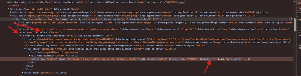
Hero Cards
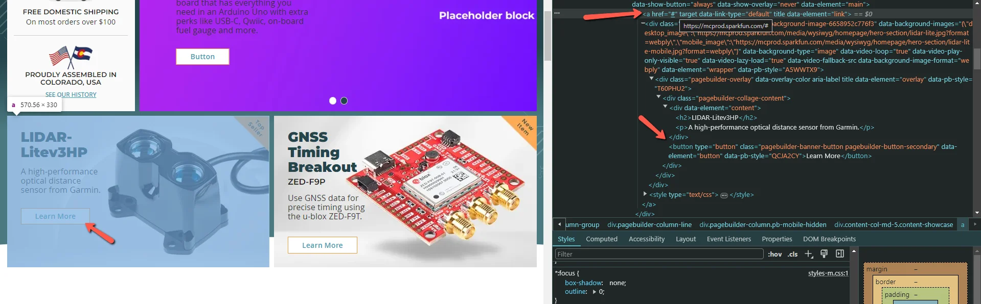
Explanation:
In order to address issues 75 and 72, classes were created to:
- The button inside those banners shouldn’t be focusable
- Those banners should have a role and an aria-label attributes set
Implementation:
Add the classes to the banner element:
unfocused-button homepage-banner
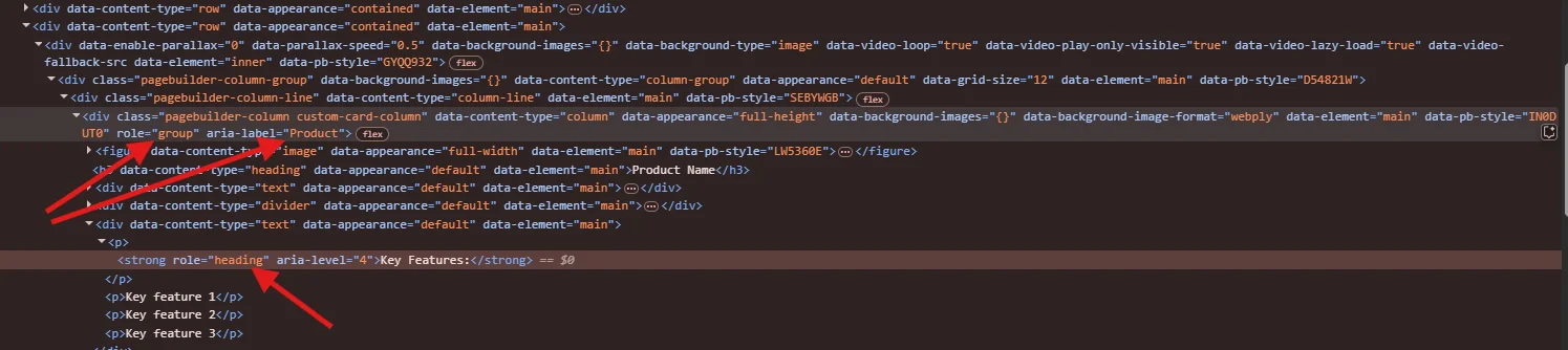
Custom Product Cards
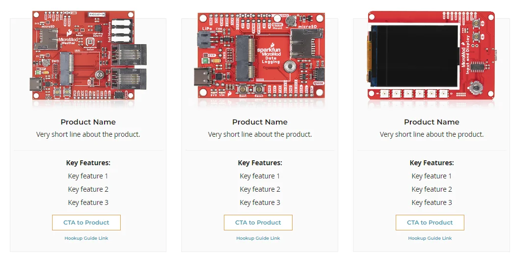
Explanation:
In order to address issues 257 and 259, a class was created to:
- Add a role to each card
- Properly mark headings
Implementation:
Add the class to the column element:
custom-card-column
Banners
Content Sizing
A set of classes were created with the purpose of immitate the Bootstrap's Grid System. With these classes you can manipulate the width of the Banners inner content for each screen.
The following are some concepts/parameters that you should know in order to be able to implement these classes properly:
Screen Size:
- xs: 0px - 640px
- sm: 641px - 768px (If you don't specify a class for xs, it will use sm if specified)
- md: 769px - 1024px
- lg: 1025px - infinite (If you don't specify a class for lg, it will use md if specified)
Grid Size:
Expressed between 1-12, where 12 is 100%, 6 is 50%, 3 is 25% and so on.
Implementation:
The class naming for this specific element is the following:
content-col-{{screen-size}}-{{grid-size}}
Where {{screen-size}} should be replaced by either xs, sm, md or lg, and {{grid-size}} with a value between 1-12.
You can use multiple classes for the same element.
Here you can see some examples:


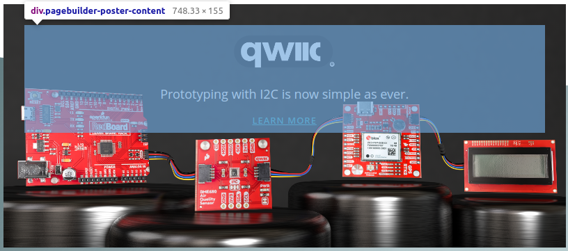
Showcase
The banner elements in the Magento PageBuilder element allows you to add an image, which is treated as a background image, content and button.
The content always goes on top of the background image, but the showcase class gives you the ability to place that content below the image. That way the image is fully displayed without anything on top of it.
This is the class name
content-showcase
NOTE: This class only applies to mobile

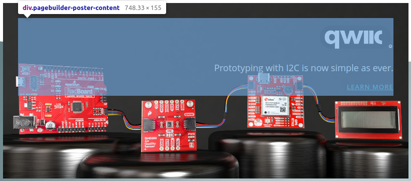
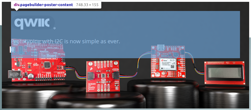
Content Alignment
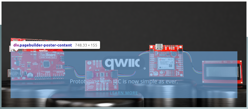
These classes allow you to set a Vertical Alignment for the Banner Content (only with the "Poster" Appearance). Following the same {{screen-size}} convention as with the "Content Sizing" section, we offer classes with this format:
content-align-{{screen-size}}-{{position}}
These are the values that you can use for those parameters:
- Screen Size: (check the Content Sizing section)
- Position: Top or Bottom
Examples:

Content Text Alignment
Somtimes a user wants to have a different text alignment depending on the scrensize. For instance, the text in banner could be left-aligned on Desktop and center-aligned on Mobile. This is the class convention (only applies to banners with Appearance = "Poster").
content-text-{{screen-size}}-{{position}}
These are the values that you can use for those parameters:
- Screen Size: (check the Content Sizing section)
- Position: Center, Left or Right
Examples:
Custom Classes to Hide and Order Columns
- "pb-mobile-hidden" (class that will hide element on mobile, under 768)
- "pb-tablet-hidden" (class that will hide element on tablet, 768-1024)
- "pb-desktop-hidden" (class that will hide element on desktop, over 1024))
- "pb-mobile-order-1" (class to order element on mobile to first position)
- "pb-mobile-order-2" (class to order element on mobile to second position)
- "pb-mobile-order-3" (class to order element on mobile to third position)
- "pb-mobile-order-4" (class to order element on mobile to fourth position)
pb-mobile-order-2
pb-mobile-order-2
pb-mobile-order-4
pb-mobile-order-1
pb-mobile-hidden
pb-tablet-hidden
pb-desktop-hidden
Buttons
Following the proposed designs, several new classes were created to be used by the client in the page builder.
Are they:
- pb__button--sm
- pb__button--md
- pb__button--lg


Text styles
This is a normal text style without custom classes.
This is text with a link.
This is a lead text using the "small" class
This is a lead text using the "lead" class
Text (Mobile)
This is a normal text style with only the "mobile" class
This is a text with a link using the "mobile" class
This is a lead text using the "small" and the "mobile" classes
This is a lead text using the "lead" and "mobile" classes
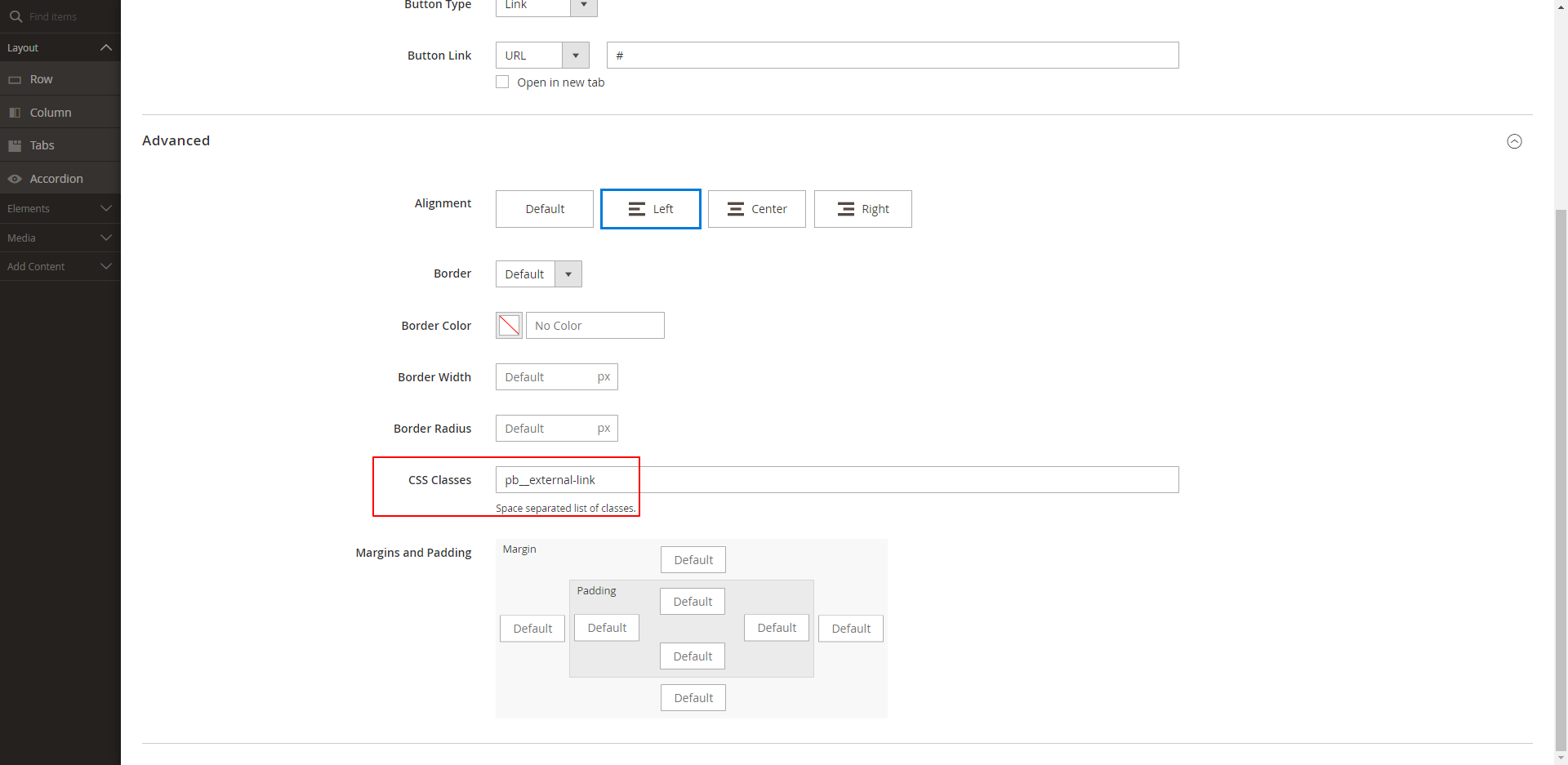
Footer External Links
To add the external link icon after the link, just add " pb__external-link " to the desired element on the footer.

Result:

This is testing the full detail pagebuilder product grid to the left. Must add class product-grid--single-product