Full detailed product card examples (default):
The two examples below are two different options on how to showcase products with full product card details. This includes the product name, price, stock status, compare and wishlist features. Preferably we will stick to the carousel in most cases. No class is needed for these options as they are the default.
Pagebuilder Product Carousel
-
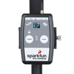
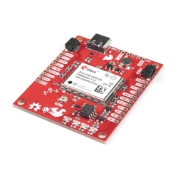
SparkFun RTK Express
$499.95Out of stock -

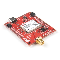
SparkFun RTK Surveyor
$399.95 As low as $339.96Out of stock -
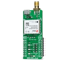
MIKROE GNSS RTK Click
$229.95 As low as $206.96Out of stock -
SparkFun RTK Facet (Retired)
$699.95 As low as $594.96Out of stock -

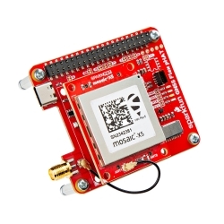
SparkFun GPS-RTK Dead Reckoning pHAT for Raspberry Pi
$289.95 As low as $246.46Out of stock -
Soldered ZED-F9P
$49.95Out of stock -

SparkFun GPS-RTK2 Board - ZED-F9P (Qwiic) (Ding & Dent)
$264.95 As low as $225.21Out of stock


Pagebuilder Product Grid
This is a carousel. Use Next and Previous buttons to navigate, or jump to a slide with the slide dots.
Using the pb__cards--menudropdown class
This class is used almost exclusively for the mega menu dropdown. It only gives the product name.
This is a carousel. Use Next and Previous buttons to navigate, or jump to a slide with the slide dots.
Using the pb__cards--clean class
This class will show the title and price of a product. Best used to keep busy pages a little cleaner.
Pagebuilder Product Grid
This is a carousel. Use Next and Previous buttons to navigate, or jump to a slide with the slide dots.
pb__cards--clean and product-grid--single-product
These two style combine to show one single clean product.
This is a carousel. Use Next and Previous buttons to navigate, or jump to a slide with the slide dots.
product-grid--single-product
These two style combine to show one single clean product.
This is a carousel. Use Next and Previous buttons to navigate, or jump to a slide with the slide dots.