Plotting Live Sensor Data with Python
Whether you are teaching a class or want to create a dashboard to plot sensor data, the matplotlib Python package has you covered! We introduce a new guide that walks you through the basics of using matplotlib.

The Raspberry Pi (along with many other single board computers) offers the ability to directly connect to low-level hardware through its GPIO header. With this, we can communicate with sensors, take measurements and even use languages like Python to dynamically create graphs for us!
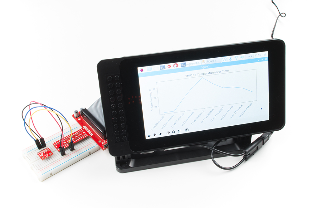
The ability to programmatically create graphs can be extremely useful if you want to set up some kind of monitoring system or dashboard to, say, keep an eye on your room's temperature. This could also be useful in classrooms to give students immediate feedback for sensor data, as well as create professional plots for reports.
Matplotlib is a plotting package for Python that works very similarly to the plotting functions found in MATLAB. If you're looking to find out more about matplotlib, check out our newest Python tutorial:
Graph Sensor Data with Python and Matplotlib
July 23, 2018
Use matplotlib to create a real-time plot of temperature data collected from a TMP102 sensor connected to a Raspberry Pi.
If you were going to make an interactive dashboard that shows live graphs, what kind of data would you want to show? I may or may not be looking for ideas for my next tutorial...


Good way to get started with matplotlib and python. Just to point to an alternative way of streaming live data, install and pipe your data to kst. Check it out here, https://kst-plot.kde.org/ Also python based, but no programming needed for most cases. Works great.
I didn't know about kst. It looks pretty slick. Thanks for sharing that!
It is nice to see single value data being added to the dynamic graph, though what I've been working on recently is the FFT of a signal for audio processing. That requires a larger than one datapoint payload to be visualized and has been giving me a hard time to figure out how to implement a kind of "spectrogram" to verify live data frequencies.
It would be awesome if you could create an example that works with Matplotlib (and possibly plot.ly‽) that updates the whole graph instead of just the tip of it, like a sliding frequency of a whistle maybe... :)
If you look at the live plot example, you'll see that we are actually updating the whole graph in the animate() function. Because we just append to the end of the graph and then remove the first element, we are, in effect, just updating the tip. The example should work for you if you pair it with numpy's fft function (e.g. https://plot.ly/matplotlib/fft/).
Just a thought: Rather than using the TMP102, use the BME280, which also gives humidity and barometric pressue. True, it's a bit more expensive, and you'll likely have to do a bit of programming to get the data out of it, but it will give you more parameters to plot simultaneously. (You can start by ignoring the humidity and pressure readings, then add them on as "further exercises".)
Although I haven't tried it, according to the documentation, the BME280's pressure readings are accurate enough to be able to sense altitude changes on the order of inches, which students could easily generate if the sensor is attached via some longer wires.
Thanks for the heads up! I originally thought about using the BME280, but the amount of programming was too much for what I wanted in a simple demo. Currently on my to-do list: write a BME280 Python package to make it easier to work with :)
I had written some code for an ESP8266 (Arduino IDE interface), but unfortunately due to a hardware failure I lost the source code, though I'm trying to do some "data recovery" on the disk (or actually an "image" of the disk). It had corrections for altitude, and also calculated the dew point. I have one processor that's using the program.
Sorry to hear about the hardware failure, those are always a pain to deal with. Good luck with the recovery!
Would this work with the Pi-Plates? I have some and would like to use these with the graphs.
Yes, matplotlib is an independent package and does not care where you get the data from. Note that the code will not work as-is from the tutorial, as it relies on I2C sensors (and from what I can tell, the DAQ PiPlate connects to analog sensors). You would just need to write some code to collect data from your particular sensor, but plotting should work the same.