
We have made a couple mentions (namely here and here) about the OSHW definition and logo. This has been an on-going collaboration between many like-minded individuals who want to hash out the definition of what, exactly, is "open source hardware." The goal is to make innovating together easier and more effective by having an established set of guidelines. The first step was getting down a V1.0 definition of open source hardware - which they did here.
![]()
The next step is what you see above - the OSHW logo. Many people submitted their designs and after votes were cast, this logo came out on top. You can expect to see this start to pop up on projects and boards from all around the globe.
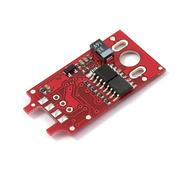
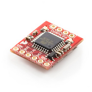
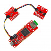
A couple of open source products - the OpenServo and the OpenLog.
If you want to apply this logo to your own projects in support of OSHW, simply go here and copy the code to your website. This is just the beginning, but we think this is the start of a very good thing! Happy Monday, folks.


That dark blue outline around the logo is totally unnecessary and the kerning of the type is terrible. Someone with a clue please fix it before it spreads across the world. The space between the "ope" needs to be tightened up, the space between the "r" and the "d" needs tightened up, the "dwa" needs slightly opened up and the "e" at the end looks like it's wondering off.
agree, kerning could be better
what the hell is kerning
Kerning is the relative spacing between letters. Basically, you want the same amount of visual space around each letter.
There's a poster up here in Pittsburgh for the show ANTIGONE (pronounced Ant-ig-oney) that looks like it's (ANT I GONE) because of how much space is around the I.
LOL You people need a girlfriend!! lol
I disagree about the dark blue outline. It may be unnecessary, but it adds a slight level of contrast and gives it a wee bit more of an electronics hint (although I respect that the logo isn't intended only for electronics, that sure seems like the primary application); if only it were green ( sorry, not SFE red ;) ).
I agree on the kerning, though.
open har dwar e? granted, the type of the 'r' doesn't exactly allow for much tightness, but this looks.. odd.
Edit: Something like this. Working on low-res image is far from ideal, still a bit tight around the 'w'.
http://img695.imageshack.us/img695/2091/ohkerning.jpg
I like your version!
That looks perfect. I would just swap it out for that one if I was them.
Yes, I like the outline, too. You can quibble about how thick to make it, but I think it adds something good to the design.
As far as color goes --- I am so damned sick of green! For some reason, it's getting overused. ;-)
I agree at least about the kerning. In both places there is too much space after the r. And they could open things up around the w.
People don't realize it, but kerning is a big deal.
I've got to agree with you about the kerning. It's dreadful, yet easily corrected.
Totally agree. The outline shouldn't be there
Eh, I actually really like it. it's not the one I voted for, but it was one of my top choices. I actually like the way the type is set. I don;t think any of it needs to be tightened, and the "e" is definitely not wandering off the end.
This is a fine logo. It's simple, can be easily taken to one color printing, and is iconic (and importantly to me, it is appropriate for many licensing types).
Yes the kerning could be better, but that can and will be fixed I am sure.
The color is a non-issue too, it will likely be one-color screen printed, routed, etched, sewn, burned, cut, etc. anyway.
I'm just glad it's settled, as this is likely the last news post where I will have to wade through copious whining on this particular topic.
I spent ages working out what that meant before finding this page. The best I could come up with was Oh Shit, How, Why ?!?
Check out this revision I made to it due to the bad kerning.
The Revision
Why choose a lock inside a gear for "open" hardware? (while it's locked)
I love Open Source Hardware and Software so I made a 3D copy of the logo, added some lights and uploaded a 3D render on the Open Hardware Summit Forum on the "this thread" linked by Eric-Montreal in his post above.
So wait, the logo is essentially a defective gear? Does anyone else find it sad that the logo allows for the alternate interpretation of "open hardware results in something that probably won't work well"?
Actually, I am a Mechanical Engineer and there are many applications that use gears like that. There are even asymmetrical gears that are non-circular.
Anyone have eagle part for this logo..
Much more importantly, how about gEDA and KiCAD versions of the logo -- you know open source EDA tools. Why does everyone insist on using closed-source cripple-ware to design open hardware projects when good open alternatives exist?
You can find it here on openhardwaresummit.org and you can even get it as almost free decals !
I really think it would of been a better logo if it was just an icon or something and didn't have any writing at all so you could just simply have the logo silkscreened on the bottom of your PCB hiding in the corner or something but nows there's this uneeded mess with words and what not.... :/
What might work is to specify that the text is optional.
I think the logo works, but it could use a "once-over" by professionals. As mentioned above, there are some obvious small fixes, but the overall concept is good. I wouldn't say great, but it is unique, simple, clean, and easy to get, and meaningful.
I think that it was good to have public submissions for the general idea of the logo, but after that, it should be handed over to people who know what they are doing when it comes to industry logos.
Either that, or you make the logo itself open-source.
The author encouraged improvements of the design, and it's going on in this thread. Kerning corrections (and translated versions) could be presented there.
However, once it's settled, it would be better to trademark it, just like the OSI did with their logo to prevent inappropriate use.
That is good to know. Although, how could you use an Open Source logo inappropriately?
By slapping it on non open source hardware, just like some products call themselves "Fair trade" or "green" without respecting accepted guidelines, thus raising doubt about what is genuine and what is not.
Having a trademarked logo allows the logo maintainer to block abusive uses (lawyer cease & desist as a first step and legal procedures) and it's a strong deterrent.
While I can understand why companies would like people to think that their products are more eco-friendly or fair than they may actually be, what possible benefit could a company get from "pretending" that their product is open source? It is like releasing something under creative commons, but then trying to go after people who use your work.
The worst thing I could think of is claiming that something is open source and then not really providing any details, or inaccurate details. But seriously, what would be the point? To get 1337's or geeks like us to buy their product? We'll know soon enough if the plans aren't provided.
I'll give you just an exemple. PJRC is the maker of the Teensy, a clever Arduino derivative design, and while not strictly OSHW (as it predates it) he's somewhat close and gives away schematic diagrams, etc ...
His design was counterfeit in China and sold on EBay.
It's clear PJRC is no big business, so the risk for counterfeiters is nearly zero.
Now suppose he released it in a OSHW compliant manner and the logo is trademarked and enforced. Would the Chinese seller and it's retailers use the counterfeit logo, still not respect the "BY" clause by illegally associating themselves in the design (their website on the box), not respect the "NC" clause, and risk all shipments from their distributors being blocked by customs for inspection and seized in most countries ?
They could still sell it without the logo, but then everyone would know it's a fake, and most would not take the risk to buy it.
You also mention it's just between geeks (or is it 933k5 ?) and at this point, it might not seem very important, but if the OSHW movement caches on like open Source Software does, this will change (else the whole thing will not really matter anyways). Imagine a few years from now if anyone can get their furnitures either at Ikea or use open source plans and have them cut in their local CNC shop. Some will hate that and fight it hard, that's when solid legal foundations become important and it's way too late to start thinking about it.
Perhaps ironically, the Teensy clones are probably more open than the Teensy itself. Teensy famously uses a proprietary bootloader for which not even the binary is available. (Meaning that, amongst other things, if you start off prototyping using it and then build a custom board you have to use a different bootloader speaking a different protocol on your own board. This may also require changes to your code.)
The Teensy clones apparently use the standard Atmel bootloader. That's publicly available, fully documented, and and there's an 100% compatible open source equivalent.
I bought a genuine Minimus AVR 32 rather than the Teensy partly because of this, though also because of the cost of shipping from the US.
Looks like I took a bad example, I should have researched better ;-)
The point was that the logo, if trademarked and enforced, can become a very useful tool to enforce the OSHW compliant licenses.
I liked this one.
I like that one as well. It is simple and easy to reproduce.
Eh. I like it. I've modified it to see how it'd look without the dark blue outline, and I must say it looked AWFUL. Sure, the kerning isn't the best, but it's better than most of the logos that were submitted ( especially the ones that were just MS paint outlines ).
Bleh, so now we get to suffer that amateurish logo on every one of these OSHW devices? That logo competition was like the 2004 US presidential election where every candidate sucked. Can we at least get a recount?
BA DUN KSHHHHH
This was the best choice on many levels as it extends the very same open source concepts beyond software.
Now back to individual licenses CC-BY-SA or CC-BY-NC-SA are popular, but a mechanism that allows for developers compensation by manufacturers would be welcome ...
"Now back to individual licenses CC-BY-SA or CC-BY-NC-SA are popular, but a mechanism that allows for developers compensation by manufacturers would be welcome ..."
Those licenses stand entirely free from commercial interest.
I.e. I can license out an orighinal work as CC-BY-NC-SA -and- at the same time sell that exact same design, commercially, under different terms to an interested manufacturer, as the original design is not use-restricted to the terms of any license.
Somebody else taking my CC-BY-NC-SA and incorporating that into their design, or building a derivative from it, however, cannot do so as well.
Sure, there is the dual licensing (both CC-BY-NC-SA and "Talk with us").
It can work, but it's a negotiation usually wrapped in secrecy, manufacturers don't like the uncertainty, most designers don't like the negotiation process, and I think all would benefit from clear and open rules.
A simple principle could be royalties, with threshold.
Such licensing could be expressed that way (just an example) :
CC-BY-R7+5-SA
R would mean Royalties, 7 would be 7% of sale price, and the optional 5 would mean free until a total of 50$ in royalties are due (to allow free (beer) test runs or micro scale use).
That way, the rules would be clear from the start for everyone involved, fair and an integral part of the licence (allows law enforcement/customs to seize unlicensed copies).
Just my 0.02