
Behind the scenes at SparkFun, we’ve been working hard on making our website easier to use (and nicer to look at). Earlier in the summer we launched our new navigation with faceted search. Since that time we've directed our attention toward overhauling our old product pages.
Featured Product Information
Here's a quick rundown of a few of the new features/arrangements that you'll now see:
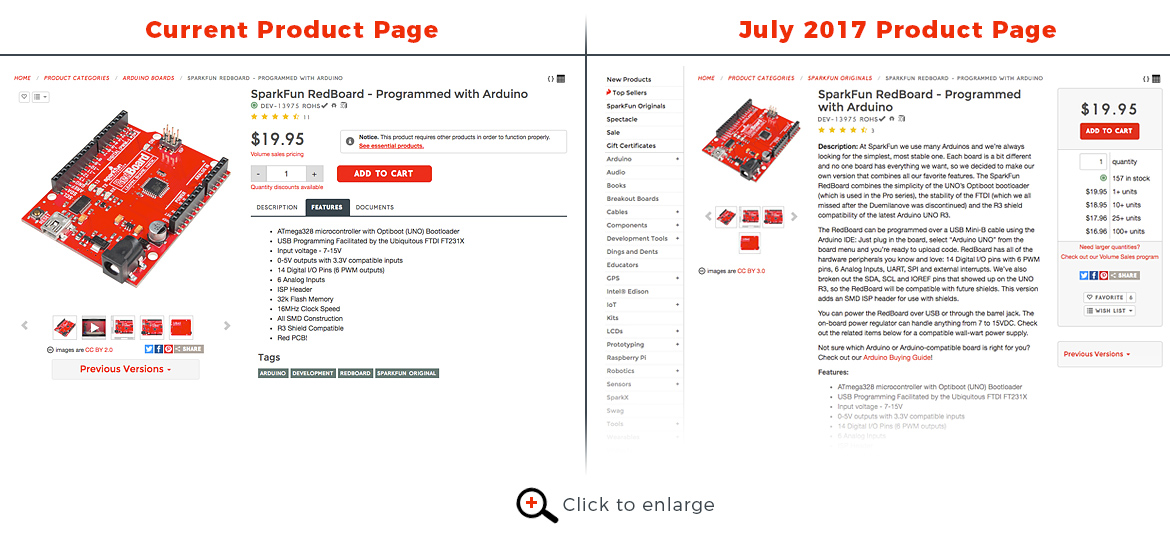
- Larger product image:
The images were the single most clicked-on item on our product pages. We've more than doubled the size to give you a detailed shot of each product right upfront. Of course you still have the option to click on each image to enlarge it even further. - Video included in image carousel:
Many of our products have a dedicated video. Including it with the images helped open up a large amount of space that the videos used to take up under the product description. - Product information tabs:
So many of the items we carry have a lot of functionality, and we want to make sure we include all of that information. We found that the Description, Features and Documents could be separated into tabs so you can quickly find the specific attribute you are looking for. - Addition of "essential items":
With a robust catalog of more than 2,000 products, some of the products that we carry need other products in order to work properly. A lot of times this is as simple as a making sure you have a power source.
Better Recommendations

Our No. 1 goal is to make sure you can find everything you are looking for. That said, we've given more insight to the recommended products we provide. Previously, we only provided a single row of recommended products that didn't really let the user know why they were being recommended to them. We've now separated them into Hookup Accessories, Similar Items, and Frequently Bought Together to give you a better understanding of why these items are being recommended.
Dedicated Help and Resources Area
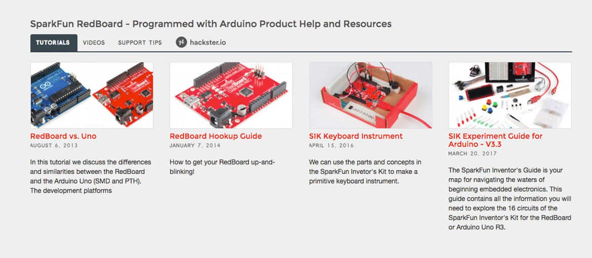
At SparkFun we do a lot more than simply provide the products you need for your projects; we also do our best to support your quest to gain a full understanding of how to use the products. We've combined all of the help and resources we provide into a single area where you can find tutorials (including hookup guides), videos, handy support tips and user-generated Hackster.io projects.
We hope you find the new product page design to your liking! As always, feel free to leave any feedback below. On to the next project!


I might be a bit of an old fart but I really miss how easy it used to be to manage your wishlists and add/remove an item from it. The new layout seams a bit more cumbersome every time I try to add an item to my wish list. Just my 2 cents.
Thanks for the comment. We haven't really changed anything in the way that wishlists work, just the location of the button. If you hadn't noticed it's now above the large image. We'll soon have a link put in that dropdown list so that you can access all your wishlists a little quicker as well. Hope that helps you out!
It was the textless button that got me! I'm not a big fan of the flat world these days but I understand. It's far more universal to language being flat images.
Just wanted to let you know that we've added a link inside the wishlist button dropdown to see all your wishlists. After your comment, we really realized that it was a little difficult to get to your wishlists since we removed it from the primary navigation. Enjoy!
I've found the new layout frustrating. Searching datasheet no longer will locate it. On a monitor with tons of real estate I have to go back and click back and forth between tabs now to get all the info I am looking at. On mobile it is even more back and forth.
It feels like the specs and documentation are not hidden on most products.
We appreciate the feedback and understand that not everyone will be thrilled with the new changes. We wanted to give each product a feel for consistently to find what you need. If you are used to searching to find the datasheets, just know that now they will always be right under the documents tab. As for the mobile view we've found that most screens will show all the information under the tabs at the same vertical location with minimal scrolling.
My 2 cents... obviously bigger pictures are great -- a lot of times looking at a picture is easier than digging through the data sheet for certain simple questions. And I like having better recommendations, of course. Much easier again to click on a suggested item than try and read the data sheets or tutorials. My biggest issue is with the layout. Granted, I really don't like change, and I didn't find any defects in the previous layout, so maybe I'll get used to it over time, but I have a hard time finding things in the new style. Where everything used to be all on one page, now it's hidden it tabs and carousels.
The biggest issue for me is the location of the comments and reviews. Typically these are where I spend the most time, and now visually they seem hidden away. Once you scroll past Hookup Accessories and Similar Items (which seem to have a lot of extra vertical white space, making the travel distance larger), you reach Skills Needed, and it's a large, muted gray section that in my mind means "you've reached the end of the page!" If you scroll a little farther you get yet another carousel with Frequently Bought Together items, and just when you start to say "hey, did they get rid of comments?" you find them underneath the actual gray section that indicates the beginning of the footer.
Shorter version: Bigger pictures -- yes. Tabbed product information section -- I'll get used to it. Recommendations -- too big. Skills needed -- way too big. Comments/Reviews -- could be more prominent.
Hi Bryan! I appreciate the feedback and your concerns are valid. We know that change is hard, but we appreciate having you as a customer and hope that you get used to the new changes!
A big challenge with a website having a website with over 2000 products is building consistency. One of the main things we wanted to accomplish with the new layout was to give every piece of information about the product shown it's own specific area that you can consistently go to to find what you need. If you come to our site and want to see the documents of the product, you know there is a tab for it. Same said with the "Product Help and Resources" section. For many products this section is much more than just the "Skills Needed". It includes Videos, Tutorials, Hackster Projects, Support Tips, and anything else that previously may have been lost in the single column with all the other information.
As for the comments and reviews, they can always be jumped to quickly by clicking on the star rating (if there is one). When doing our research we found that it's pretty common practice for customer comments and reviews to be at or near the bottom for e-commerce sites of our magnitude.
It is Amazon style as far as the vertical layout and finding reviews. Amazon puts a lot of resources behind finding the best way to generate sales so why not copy them?
Do you guys have any plans on adding configuration options to your product pages? For most instances it's not necessary but for products with multiple different configuration (e.g. the Actobotics motors which have tons of different speed/torque configurations) it'd be nice to have a dropdown to select the configuration rather than different product pages for each one. That way reviews and comments could be collated together.
Great question, that's something that's been talked about quite a bit and it's certainly in our future vision. Unfortunately, I can't give any estimated date of completion. We've got a few other web projects that are going to come before we get to similar product configurations.
Thanks for the transparency! I'm no web developer but I figured it'd be a fairly involved change. Good to know it's at least on the radar.